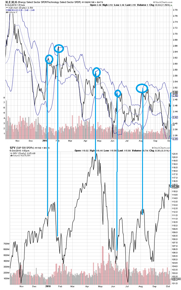
A little chart porn for you. I only bring this up b/c the last time oil names broke out, they failed and it did not end well.
Top chart is performance of energy (XLE) relative to tech (XLK). When it gets stretched to the upside (tech falls off and/or energy runs) it can indicate market instability.
Remember, there's sampling bias, confirmation bias, and so on. Trade this on its own and you'll lose money.
