Let's put on our bear hats for just a little bit.
I don't really want to, but these charts keep coming up and I have to put them out there just to get them out of my head.
The S&P 500 has made 3 higher highs over the past 6 months. But those thrusts higher have been met with less momentum and less participation.
Have a look at a weekly chart with momentum and MAC-D indicators:

These two indicators clearly show a momentum divergence on a weekly chart. This makes sense as the price movements have had less energy over the past few events. This "3 drives to a top" is a pattern that was introduced to me by Corey at AfraidToTrade.
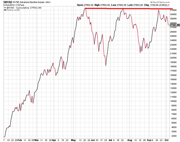
And the next chart is a cumulative NYSE Advance-Decline index:

While the market has been making higher highs, the breadth of the rallies has continued to shrink. This means that the moves higher have been led by fewer and fewer stocks.
These are the two charts that provide clear bearish technicals on the market.
Of course, there's other bullish arguments: trend is up, BoJ liquidity, Fed liquidity, corporate earnings, small caps are leading... the list goes on. But these two divergences need to be resolved or else there won't be enough breadth or momentum to sustain these price levels.